An Interview with Imagineer Tim Delaney
Page 2 of 5
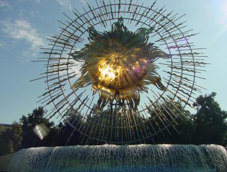
The Sun Icon
Click here for a much larger version of this picture
(1024 X 776, 138,660 bytes)
LP: Can you talk about the sun icon?
A: The sun icon. The sun icon is the ultimate final statement for our entire entrance complex here. The whole idea is that we’re walking through a picture postcard starting with the California letters, going through the images of California with the mural and kind of looking through the Golden Gate Bridge. I love the idea of the bridge because of what it represents. It’s like the ultimate icon for California as well as having the Monorail go through - the ultimate icon for Disney and then at the end of that long line is our plaza here with our wave fountain and the sun icon.
The postcard entrance to Disney's California Adventure
Click here for a much larger version of this picture
(1024 X 768, 68,628 bytes)
The intent here was to actually make it - it doesn’t have any historical historical reference in Disney, but that’s okay. Sometimes you just want to create something on your own. You create your own images. I designed it so it had kind of a compatible size relationship with the castle at Disneyland, it has the certain height and all that. I didn’t want to have an icon which is 500 feet high. This isn't meant to be that kind of relationship. But just like everything else at Disney's California Adventure it’s meant to compliment Disneyland as well as contrast it at the same time. I was very much inspired by the Unisphere for the World’s Fair in New York in 1964, and it was built of stainless steel, very elegant, very timeless in its quality with a fountain to it and that’s what we wanted to create here.
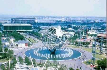
The Unisphere from the 1964 New York's World's Fair
© Copyright 2000, Alfred Gedney
Picture courtesy of nywf64.com
As you well know - it’s been well documented, I’ve said it hundreds of times - icons usually face the south and this one faces north and I quickly figured that one out and I said "how do we make it interesting?" I love building and designing things that have not only what appears to be its design but also some context to it. A good example is the Golden Gate Bridge. As a gateway for this park the Golden Gate Bridge is fantastic. The fact that the Monorail goes through it and it had to live with that, it’s like "oh, Monorail, yeah." It works great. Well the sun icon, just being on its own, works on its own. But now that we add the heliostats to illuminate it, it adds another level of intrigue. It actually adds that kind of quality of California art and science. You put all that together with a little bit of technology - technology that we had a company in San Diego actually build all the software for it. It’s a neat thing. With the sun icon, I’ve been doing things - trying to create architectural gold is very difficult to do. So every time you paint it, it doesn’t look very inspiring and everything else fades away until we found titanium. Look at it, it has a gorgeous color to it. It’s a very rich, warm color. It has a kind of a timeless quality to it also. It will be timeless. It’s never going to change for the next 500 years. There are a lot of subtle colors to it. I’m hoping it becomes just as strong an icon for this park as the castle is for Disneyland.