Land of the Rising Mickey
Page 1 of 3

Conversations with Eddie Sotto
The Tokyo Disney Resort - Part 3
After you've read this article, Discuss It on the LaughingPlace.com Discussion Boards.
This interview was conducted through e-mail correspondence during the last week of March, 2001. The majority of Eddie Sotto's comments were written from the Santa Monica offices of Progress City and the majority of Marc Borrelli's were written from a laptop computer in Tokyo Disneyland. If you missed Part I of this interview (which includes Eddie's bio), click here to read it.
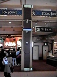
Marc: You were heavily involved in the design of Bon Voyage, the large new retail location that straddles the bridge between the entrance of Tokyo Disneyland (TDL) and Maihama (train) Station. (Sixty percent of guests visiting the park arrive and depart through Maihama Station.)
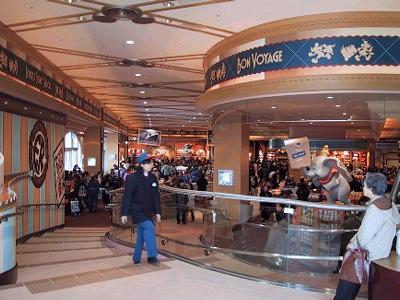
I admit, before Bon Voyage opened I wasn't a big fan of the exterior, feeling it was out of place. But more recently I've seen artwork of what the under renovation Maihama Station will look like when it's completed. My impression is that the two will tie in well. Then, after it opened and I saw the interior of Bon Voyage, it won me over. It's very stylish. I'm curious to learn more about it.
Eddie: Bon Voyage is a reaction to the environment it is in. It is more of a statement that is attached as a marquee to the train station and less of a Victorian element associated with the park.
The whole approach is meant to be graphically intuitive and bold. The interior is meant to be an Asian approach to a Disney space. We took the "office ladies" knowledge of the motifs of Hermes, Louis Voitton, etc. and had fun with it in a more minimal, streamlined way that really didn't compete with the merchandise but let it really stand out.
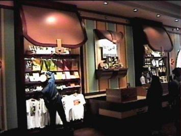
This was done as the demand and crowds are larger than the shop. The role this store plays is to capitalize on the exiting crowds and make it easy and fast to shop, a different experience than a typical "World of Disney" concept. It is meant to allow you to see what you're interested in and buy it, not be immersed in an over decorated space that competes with the products. More of a fun department store with clarity. The 40's Swing era "romance of travel" theme makes it American and romantic.
Bon Voyage sticks in my mind because the concept came about at one of our darkest hours. We had worked for months on a particular concept that we thought OLC liked. Wrong!
We had learned the day before....we were at breakfast and all pretty depressed when I had this insane suggestion for a different direction. I pitched to the wounded team a giant suitcase shaped building with travel stickers on it that the guests stepped through. The characters would stow away inside. No one liked it, or was in the mood to pursue any more of my input after what had just happened..but it grew on the team and eventually (later that day) we pitched the idea with napkin sketches to OLC and we were back on track. I look back at the crude sketch, and see how Mark Engberg and Laurence Ko (COLAB Architects) took that notion (and my rantings) and developed the exterior into what you see today.
All told, it is a record breaking revenue generator for our client and a great example of teamwork displayed by WDI, Attractions, and OLC.