Great Animated Performances: Milo Thatch as Supervised by John Pomeroy
Page 2 of 4
(c) Disney
Return of the Hero
Like John Smith, Pomeroy himself is charming, confident, and speaks with an
exacting rhythm not unlike the fife and drums that show up in his paintings. He
could easily lead a troop into battle, though his gentle and deeply personal
spiritual commitment make him an unlikely combatant and in that sense even
closer to the peace-making and nearly martyred Smith. But in a conversation with
him it became clear that Pomeroy has indeed been at war - only with some
personal artistic demons of late. More on that later, for the meat of this tale
is how John Pomeroy arrived at a critical juncture in his career after leading a
team of more than a dozen artists through one of the more complex performances
in personality animation - Milo J. Thatch, the hero of “Atlantis: The Lost
Empire.�?
“Milo’s path is very similar to my own,�? said Pomeroy in an interview from his office at Walt Disney Feature Animation. “It is the closest I will probably ever come to animating myself.�?
Pomeroy had just come off of animating the title character in the Firebird Suite segment of “Fantasia 2000�? when he was approached by friend and producer Don Hahn and directors Kirk Wise and Gary Trousdale to join the team on “Atlantis.�? He insisted on supervising the character of Milo and there was hardly any debate that the match was perfect. But as to how simple the task would be was another matter entirely. To begin with was the design of the world in which this character would live.
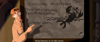
While the Batman series and the Raiders of the Lost Ark series attempted to bring comic books to the screen, it wasn’t until “Atlantis�? that anyone had gone to such lengths to bring what pubescent boys (and those really cool and way smart girls) had been devouring at newsstands across the globe for decades. The severe darks and lights of the film’s cinemascope frame mirrored perfectly the explosive story-telling approach on the comic-book page. And although it’s a well written and often repeated fact that the much maligned “Atlantis�? had its birth in a desire to pay homage to the Disney adventure films of the 1950’s, it is a too often ignored fact that the film’s visual sensibility takes its cue from the great comic books of the late 60’s and early 70’s.
A familiar story is how an artist named Mike Mignola, the creator of the “Hellboy�? series over at DarkHorse Comics, was brought on board as one of three designers hired to help establish the look of “Atlantis.�? But there’s more to Mignola than meets the untrained eye - there is a history of comic art at work within his style. The complexity of Mignola’s graphic language is rooted in artists like the late John Buscema and Jack Kirby who introduced a generation to the marvels of dynamic graphic story telling on the static page. That graphic story telling was rooted deeper in an earlier comic work called “The Spirit�? by an artist named Will Eisner. And just as Disney set the standard in animated features, so Will Eisner was the dean of comic books (and if you know “The Spirit�? series very well, then you will recognized Eisner’s influence on the more complex graphic novels of the 1990’s.) The legacy of Eisner and Buscema and Kirby are, perhaps, best refined in Mignola’s work from among all his contemporaries. Historical distillation influencing a generation distilling the works of their mentors to a work inside of a historical context. Nothing is by accident.
(c) Disney
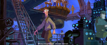
So right from the start there was a very specific world in which Milo Thatch must live. And with Dave Goetz’s brilliant art direction, Lisa Keene’s equally brilliant background supervision, and Ed Ghertner’s rather astounding understanding of the graphic novel which translated into his layout supervision, “Atlantis: The Lost Empire�? aimed to be the first motion picture to truly deserve being called a moving graphic or comic novel. It is this impressive and complex physical landscape that dominates “Atlantis�? and the resulting character designs that John Pomeroy and his team would have to animate with no less sincerity, humor, passion and life-like appeal than the characters of another Disney film. Where “Atlantis�? had to bring that most original of American story telling methods to life - so “Sleeping Beauty�? had to take the tale-telling approach of mideaval tapestry to life nearly half a century before.
In both instances, the challenge of making a character that is so flat in design have both physical and emotional depth in a hyper real world was compounded. “Atlantis�? may have been more challenging because it had a very specific historical context that is not the storybook setting of the Disney fairy tales. These are characters specific to the look of American comic art, thus more familiar to audiences. Plus, this film is set in a very specific time in American history, opening in a familiar American institution at the start of World War II. Unlike the rather static horizontals and verticals of “Sleeping Beauty,�? “Atlantis�? dares to play with cinemascope layouts that have a constantly shifting baseline. In comic books and graphic novels, character placement plays a significant role in reinforcing the dramatic impact of a scene, and how a character springs across the landscape also drives the book forward - visually as well as emotionally. The screen was the canvas for the film-makers on “Atlantis�? and like a comic novel it is defined in large areas of black - almost always at extreme edges of the screen. The backgrounds have sparse playing fields defined by washed out tones and sudden knife-like interjections of bold color that play to the emotional beats of the story. It’s a bit like “Sleeping Beauty�? redux.