
Walt Disney Art Classics Convention 2004 - Part 1
Page 4 of 13
Pacheco chuckled as he presented the following statistics, wondering just what individual at the studio worked out the math. It was stated that 6,469,952 spots appeared in the 113,760 frames of film. (That’s 79 minutes, at 1,440 frames per minute.) Needless to say, the Xerox process was used throughout, except in a very few instances where colored ink lines were needed (such as shadows).
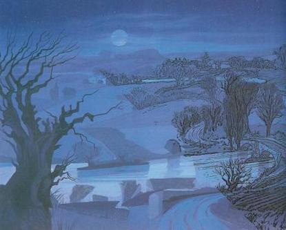
The backgrounds used behind the animated characters were also stylized, in order to match the process. According to Pacheco, this made a true blend in style between character and background possible for the first time.
Background concepts were then shown. Initially they were very detailed and cluttered, then were tightened up and cleaned for clarity. Heavier lines were used in the foreground, with delicate lines further in the background to emphasize depth.

Ken Andersen’s concept sketch would be refined before appearing on the screen.
Pacheco presented a series of thumbnail production sketches in color to show how characters and backgrounds could be delineated. Different methods included: contrasting warm and cool colors; the use of silhouettes; and defining areas with blocks of sharply defined color.
A memorable example was an early concept of Cruella de Vil’s bedroom. Deep red and stark white formed the contrast. A frame of black lace suggested a canopy and isolated the principle area. Cruella’s true nature was suggested by snake-like patterns in the head board and the base of the night stand.
After showing these early concepts, Pacheco then detailed how they were translated into final form. Paintings were created using the principles set out in the color delineations. Overlays were then matched, with line weight to maintain scale and perspective. The final consideration was the placement of characters and action. Some backgrounds would be finished only in part, so as to provide a clean area for this. (In the course of explaining this, a still of Roger at the piano was shown. Pacheco mentioned that it was veteran animator Frank Thomas himself who was used as the reference model.) Pacheco finished this portion of the seminar with a series of memorable stills from 101 Dalmatians. As each was shown, the principles he had just explained could be clearly seen at work.
This background illustrates how color washes (left) were overlaid with detailed
line drawings (right)
The next subject at hand was the animation of “inanimate�? objects. Concept art for Cruella’s automobile was shown. One early concept used snake motifs in the fenders and grille, as well as feathers and an eccentric radio antenna.
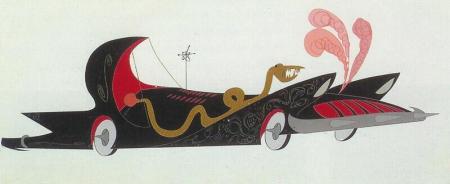
An early concept for Cruella’s car reflects snake motifs and greater
eccentricity.
Another version made her car look like a giant bat, with wing-like fenders and head lamp eyes. Eventually, all of these concepts were refined into a final form. A model of the car was then created, painted white, and detailed with thin black outlines to delineate its basic form. Photos of this model (and others, such as the moving van), shot from a variety of angles, were used for reference. (It was amusing to note that even a tiny drawing of Cruella was part of the model. Later, when the hand animation was done, she was replaced by full animation.)
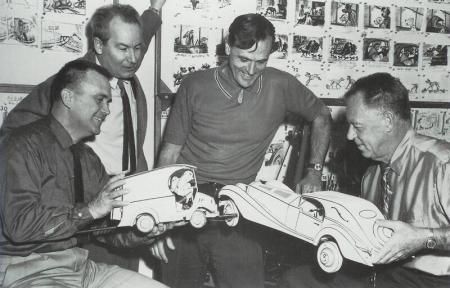
No toy cars these; these dimensional models were used extensively in 101
Dalmatians. (Left to right: Production Designer Ken Anderson, Storyman Bill Peet,
and Directors Wolfgang Reitherman and Hamilton Luske.)
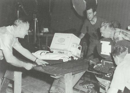
The models were manipulated and photographed for the chase sequence.