
Cracking the Communiverse: How Pixar Designed the Graphics of "Elio"


From embroidered shoulder patches to an alien alphabet that ripples like vibrating sand, Pixar’s Elio is packed with graphic design that quietly tells the story. At LightBox Expo, Graphics Art Director Kyle Jones pulled back the curtain on how his small team researched, designed, animated, and localized the film’s screens, signage, uniforms, interfaces, and end credits.
Jones started with the basics: world-building through consistent graphics. Working under production designer Harley Jesup, he built uniform sets — badges, ranks, and name tapes — plus security passes, mission patches, and signage that feel authentic to professionals while still matching Elio’s stylized look. When needed, he created custom fonts and icons, guided by consultants to keep things both accurate and readable.
One major set piece riffs on NASA’s Voyager Golden Record. Jones recreated the iconic line-art instructions and used real space imagery as projection elements — broken into layers, enhanced with stars and haze — for a dreamlike feel. A layout test of this projection space worked so well that the directors promoted it to the film’s opening.
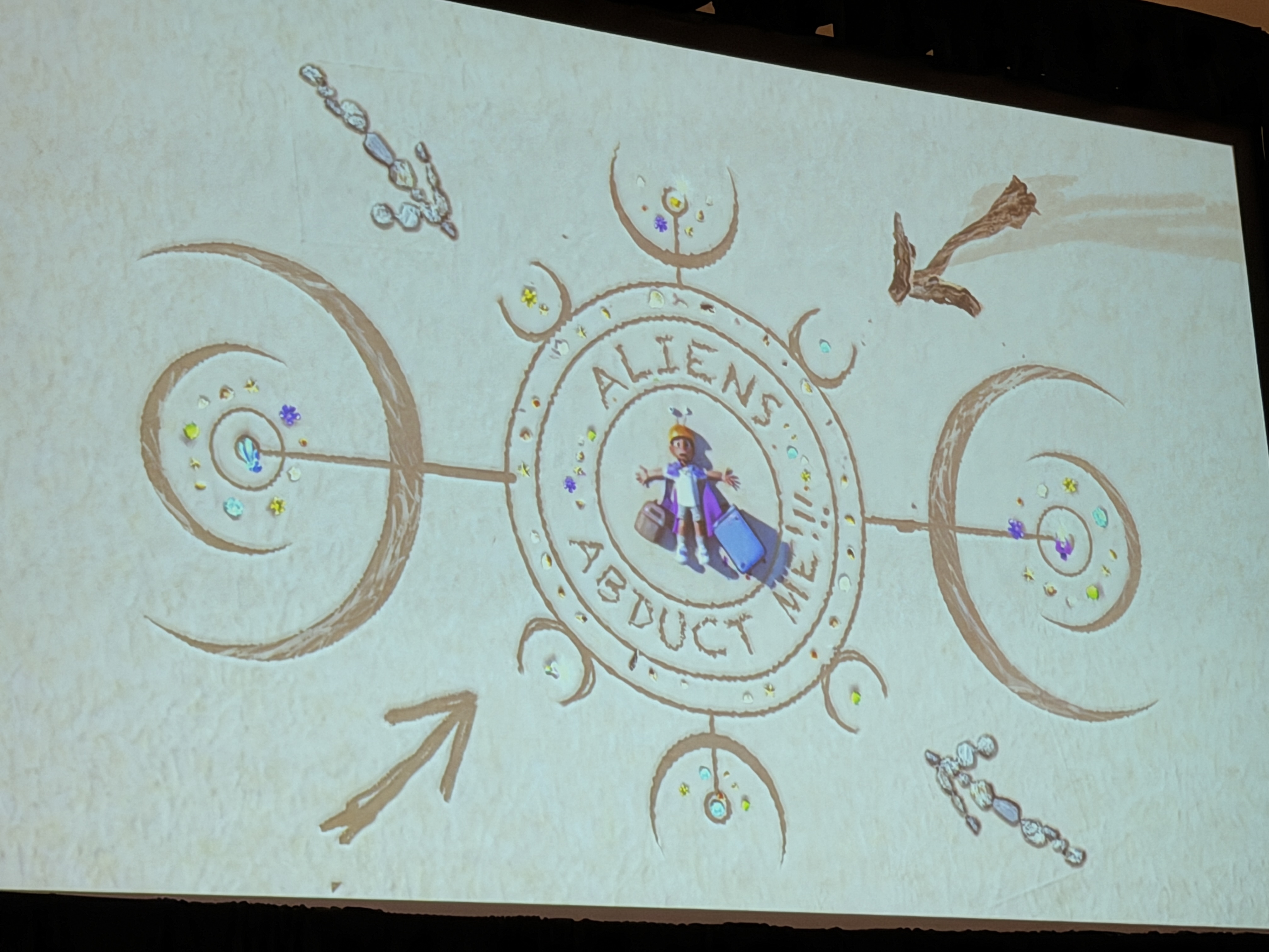
Jones also previewed early versions of Elio’s space message in the sand, which evolved from rough geometric patterns into a readable alien signal visible from above.
For Olga’s signal-tracking screens and other mission control interfaces, the team drew on gear and workflows from Vandenberg Space Force Base, then simplified them into something cinematic and instantly legible. Early mockups explored waveforms and signal readouts, evolving into a clear visual system that lets viewers grasp big-picture and close-up info at a glance.
Designing the Communiverse language started with natural references — bubble-chamber spirals, cymatic patterns, origami — aiming for a language that feels discovered, not invented. The final look suggests tiny grains swirling together into letters.
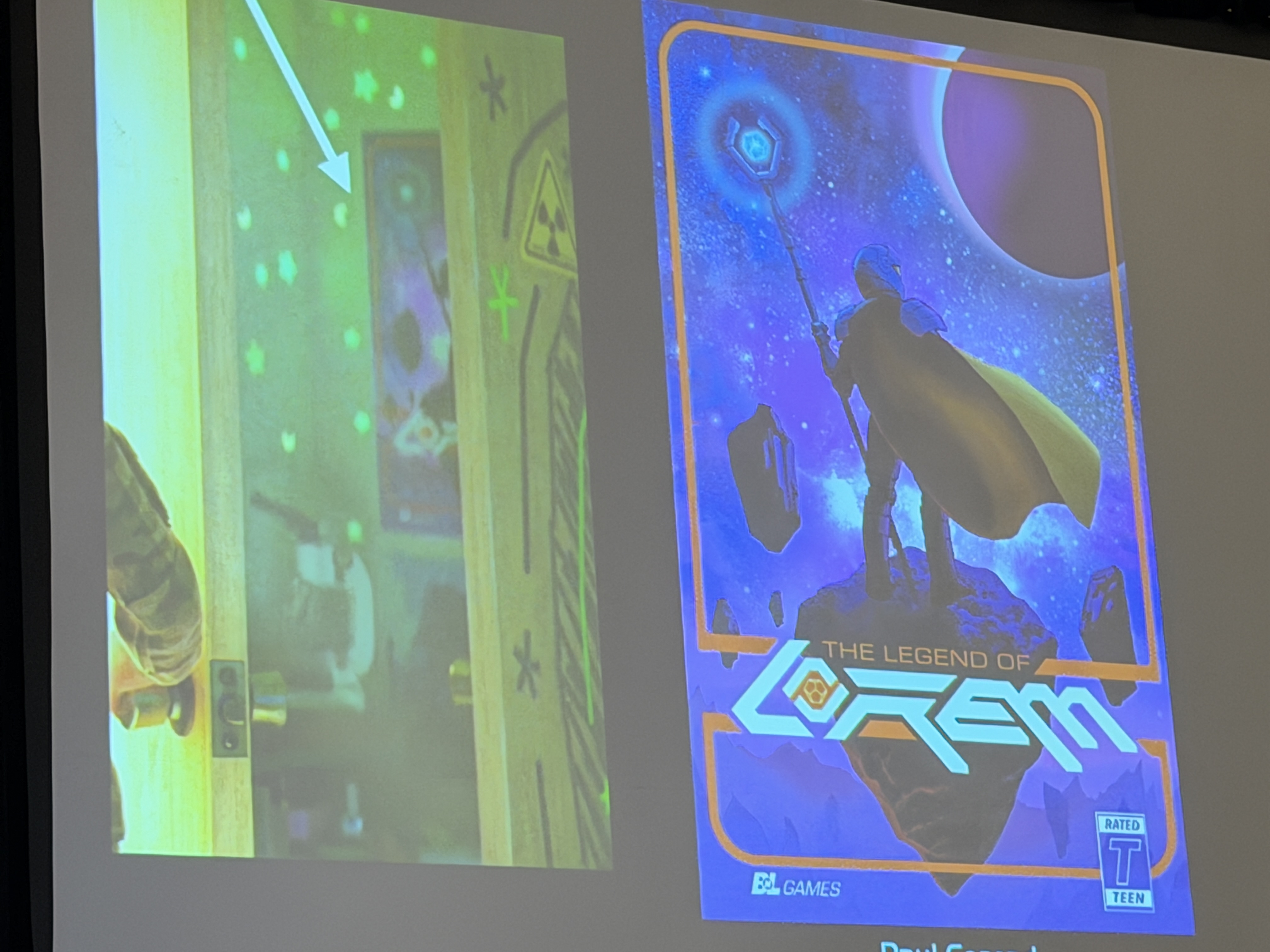
A self-described “space nerd,” Jones had a field day building Elio’s bedroom: taped-up clippings, posters, hand-drawn maps of “likely abduction sites,” and sly nods (A113, Buy N Large, Lifted stills, even a phone-telescope photo of the Orion Nebula he shot himself). The set is meticulously designed, even though only a fraction appears on screen; the density makes every angle feel lived-in. Later in production, Jones helped contrast Elio’s cozy, cluttered bedroom with his clone’s sleek, sporty counterpart, visually underscoring the divide between the dreamer and his more confident double.
For props like Elio’s ham radio, backpacks, and clothing, the team delivers clean graphics that animators can align to seams and zippers. Because Pixar translates on-screen text worldwide, key graphics were built so they’re easy to swap for different languages and pass legal review.
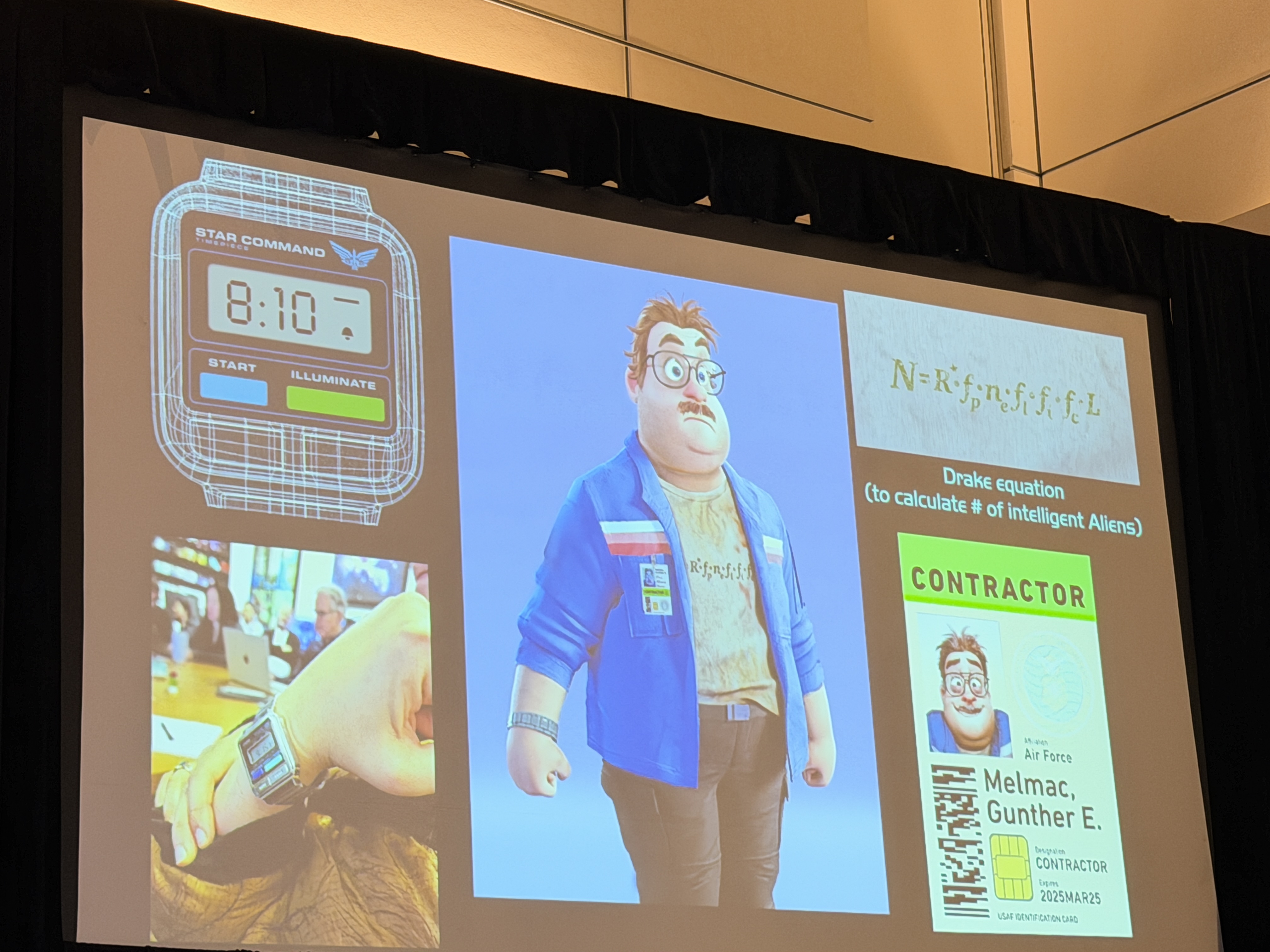
Jones helped slip in lots of Pixar Easter Eggs. Melmac’s wristwatch bears a Star Command logo, a subtle nod to Pixar’s spacefaring legacy that most viewers will never notice. Jones also tucked in a crate from the end of Raiders of the Lost Ark.
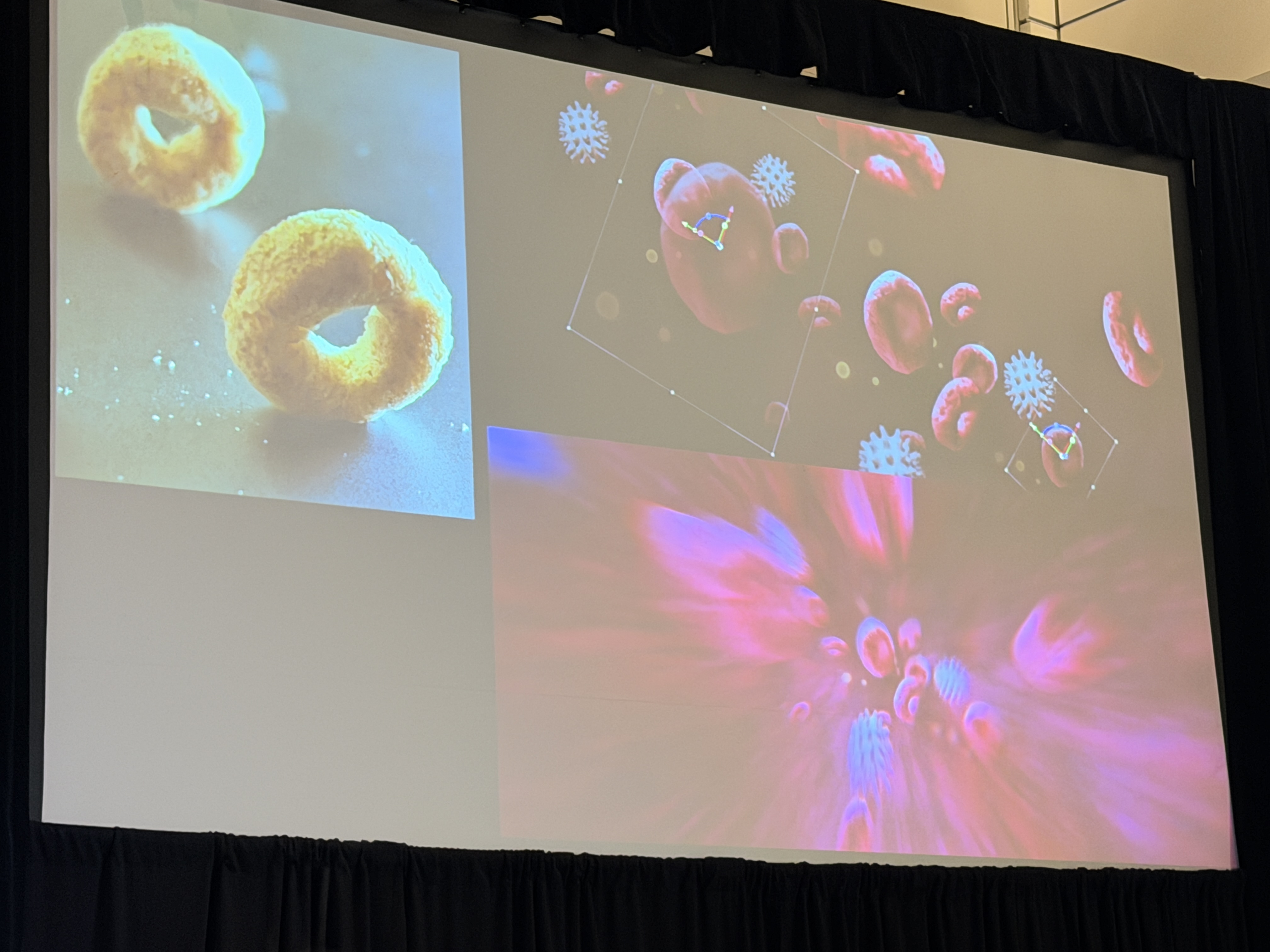
Though graphics aren’t usually VFX, Jones handled a few blink-and-you-miss-them shots himself. For a fast “inside the body” move, he photographed Cheerios as blood cells, used his hand for skin and wrinkles, added leaves for veins, then combined them with heavy motion blur. For a brain scan, a colleague provided a real medical scan that he animated to match the shot.
Every ambassador in the Assembly Hall gets a floating planet. Computer-generated textures felt too sterile, so Jones turned to real-world sources — steak-plate juice rings, cracked rocks, a frozen Michigan lake — photographed and graded into luminous orbs that feel tactile and unique.
For the Communiverse pod Elio and Olga pilot, early versions tried slick touchscreens; the final console embraced analog oddities — springs, beads, and levers with no obvious purpose — to heighten the comedy of Elio figuring it out. Behind him, large UI animations drive damage readouts and navigation, then get flattened and mapped onto 3D screens.
Jones prototyped multiple end-credit styles — mid-century illustration, golden-record motifs, storyboard constellations — before the team combined them: paint-overs from lighting art director Ernesto (from early look-development), storyboards from story supervisor Brian Larson, and a page-turning “U.U.N.” (Universal Users Manual) animated entirely in After Effects. Composer Rob Simonsen scored to Jones’s final timing, and the title font nods to Close Encounters.
If Elio feels cohesive from school hallways to the far reaches of the Communiverse, it’s because Jones’s graphics work like an invisible score — guiding our eyes, clarifying tech, and infusing character into every frame. His LightBox Expo session underlined a simple point: in animation, design isn’t decoration; it’s storytelling.