25 Years and A New(ish) Logo: Downtown Disney Celebrates Milestone Anniversary
The new logo is a bit familiar...but different.
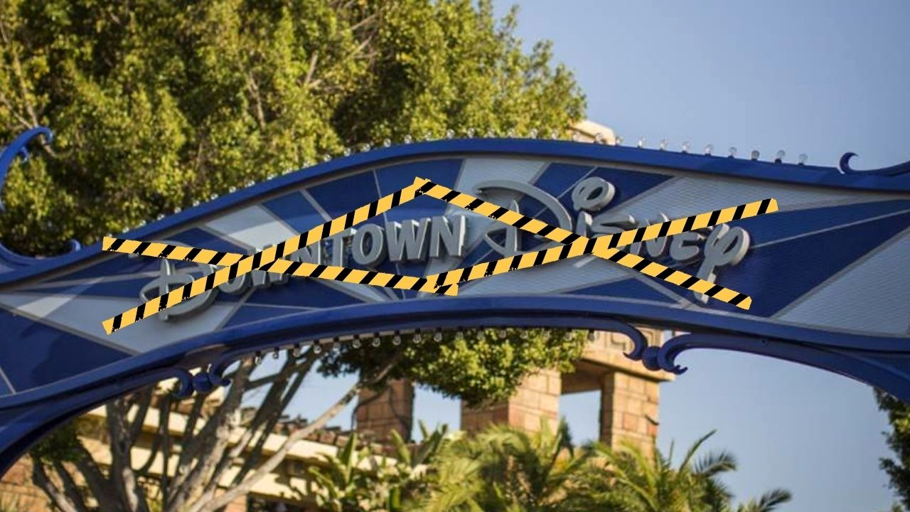
To celebrate a quarter-century of the Downtown Disney district at the Disneyland Resort on its milestone anniversary, we now have a brand new logo for the shopping, dining, and entertainment zone.
What’s Happening:
- Today, January 12th, marks the 25th anniversary of the Downtown Disney District at the Disneyland Resort.
- Originally opened in 2001, connecting all of the locations of the newly expanded Disneyland Park into the Disneyland Resort, Downtown Disney served (and still serves) as a metropolis of dining, shopping, and entertainment.
- Downtown Disney would bridge the gap between the existing Disneyland Hotel, what became the Paradise Pier Hotel, and the new Disney’s Grand Californian Hotel & Spa to the new Disney’s California Adventure and Disneyland Park when it opened.
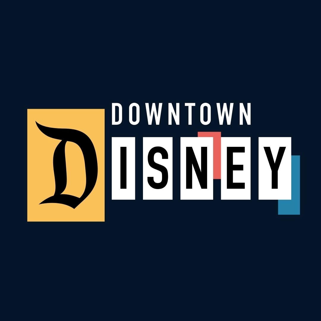
- To mark the 25th anniversary of the Downtown Disney District, Disney Parks revealed that Downtown Disney will have a brand new logo moving forward.
- The new logo features a mid-century modern motif, much like the western half of the District closer to the Disneyland Hotel on that side of the monorail tracks. That area has been radically re-done, as the former home of the AMC Theater (2001 - 2018) was demolished (in 2022) to make way for new dining and retail offerings.
- According to the Downtown Disney Instagram story revealing it, the new logo “Honors the past, present, and future of Downtown Disney District.”
- The new logo features block lettering and the trademark Disneyland “D”, all reminiscent of the former marquee sign into the original Disneyland parking lot - which parts of Downtown Disney now occupy.
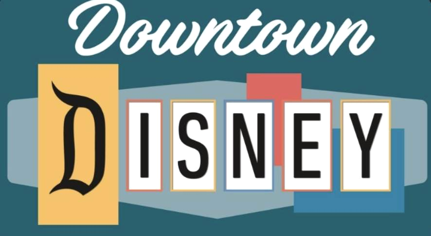
- Interestingly, Downtown Disney just revealed a new logo last year, which is not terribly different from the “new” logo revealed today.
- Gone is the shape behind the “Disney” as is the serif font, going for a more uniform look.
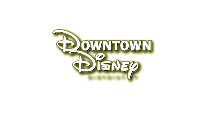
- Both are far cries from the original logo, which features a more corporate Disney “D” as opposed to the Disneyland gothic style “D.”
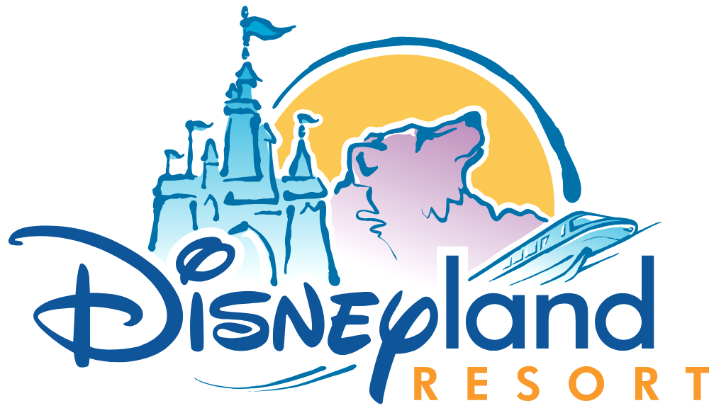
- Similarly, those D’s were prominent in a new logo for the Disneyland Resort that debuted back in 2001, which can also be seen below.
- That one was later dropped in favor of a more classic look, celebrating the original Disneyland gothic typeface. With the return of the classic look, it makes sense that the Downtown Disney logo finally fell in line with the classic gothic “D” of their own.
- To visit Downtown Disney for yourself, as well as the rest of the Disneyland Resort, be sure to reach out to our friends at Mouse Fan Travel.
- To see more of Downtown Disney on its 25th anniversary, be sure to check out our livestream below.
Laughing Place recommends MouseFanTravel.com for all your Disneyland Resort travel planning
Fill out the form below for a free, no obligation quote from MouseFanTravel.com


